


BCG Logo & Marketing
"Make it look solid"
"Make it look solid"
With close to 20 years of experience in the construction industry, mostly focused on underground utilities, the client knew what he didn't want for his company name and logo: a name that would be changed by guys in the business into something....else...or a logo that looked generic.
Bedrock Construction Group was selected for the solidness represented by bedrock; "Group" allowed for expansion into different areas of construction. Naturally, the most discussion took place concerning the contour lines of the mountain...
Bedrock Construction Group was selected for the solidness represented by bedrock; "Group" allowed for expansion into different areas of construction. Naturally, the most discussion took place concerning the contour lines of the mountain...

The final logo: simple, solid and easily scalable for everything from business cards to excavators.

A yard sign to be placed in front of a residence.
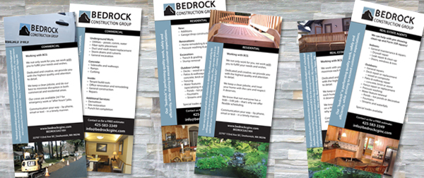
A series of intro flyers was developed for three specific markets: Commercial, Residential and Real Estate Agents.
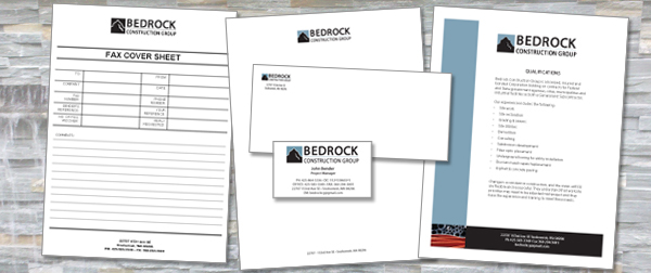
The forms, business card design and qualifications statement.

The company website. I created the headers and modified the template provided by the hosting company.

I designed the layout and write most articles for the company blog. It will eventually consist of a number of pages related to the different groups or specialties within the company.


